Welcome to my interactive data visualization projects.
I love tinkering, exploring, and discovering. And, interactive data visualization lets me do all of it.
The ability to layer data from macro to microscope and creating fun interaction is fascinating. Data Visualization can provide insight, an opportunity to explore large amount of data and raise questions, and ultimately lead to actionable information for the audience.
These are my side projects created with d3 (javascript library), data cleaning and wrangling were done in python
If you want to visualize any dataset, you can contact me at jbk1109@gmail.com
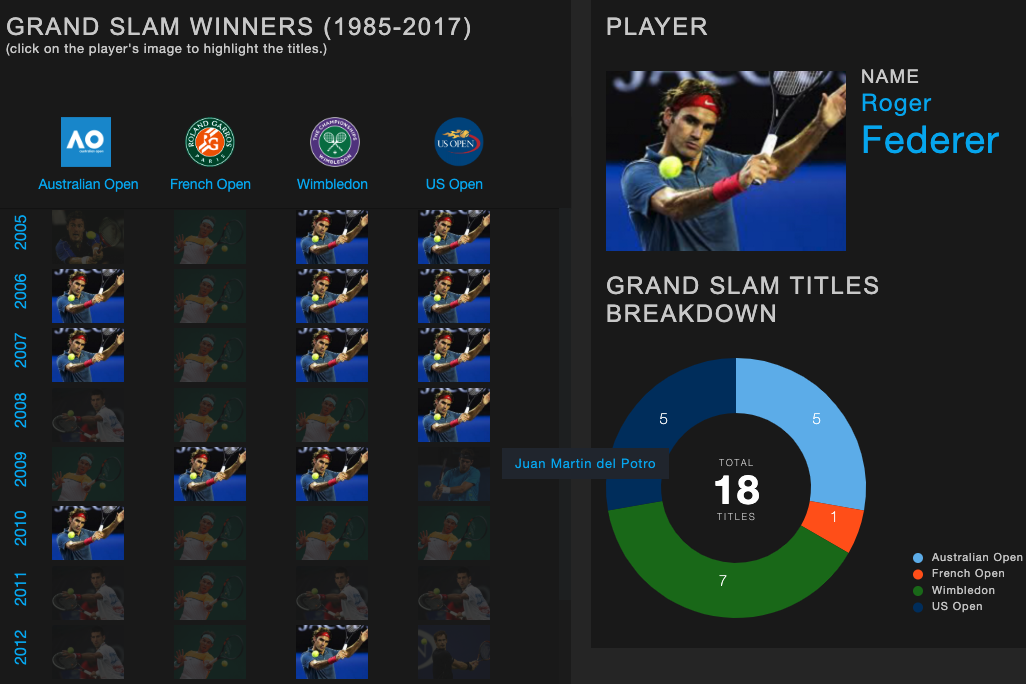
Tennis Grand Slam Winners (1985-2019) - 2nd Iteration

Grand Slams refer to the 4 major tournaments played on different surface types. The surface difference favors different playing styles, although the difference diminished over the years. Since mid 2000s, fewer players have dominated the Grand Slam. To visualize the trend, this allows selection and comparison of players' Grand Slam titles and their streaks in timeline with their image.
*Data Source: www.wikipedia.com, www.atptour.com
- See the visualizationWorld Dominance Trend Map in Tennis (1982 ~ 2016)
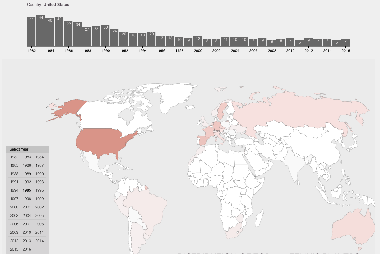
Dominant nations in tennis have changed over the years. Using a choropleth map, this visualization shows the shift in the distribution of top 100 tennis players' nationalities from 1982 to 2016. Additionally, the timeline bar graph displays numeric data on a selected country.
*Data Source: https://data.world/sixmanguru/mens-year-end-atp-rankings
- See the visualizationTennis Grand Slam Winners (1985-2019) - 1st Iteration
Grand Slams in tennis refer to the most prestigious 4 major tournaments. This visualization uses a player's image to highlight his grand slam victories in a timeline and shows the breakdown record in a pie chart.
*Data Source: www.wikipedia.com, www.atptour.com
- See the visualization
World Immunization Trend (1980~2013) Line Graph
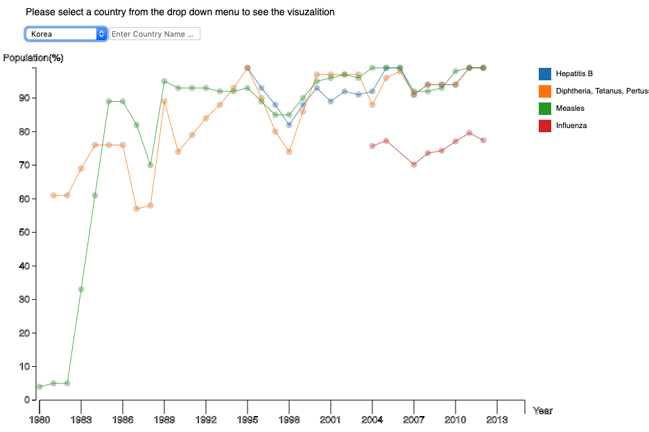
Immunization is an important mark in modern medicine. I wanted to visualize the trend of immunization in countries over the years.
I first began with a line graph in conjunction with scatter plot. You can select a country to view its immunization history from 1980 to 2013.
*Data Source: wwww.oecd.org
- See the visualization
World Immunization Trend Stacked Bar Graph
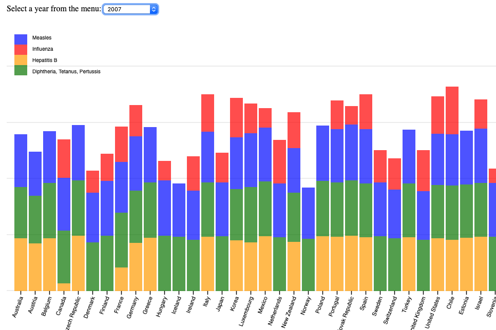
After creating the line graph of immunization history, I wanted to create a visualization that allowed easier comparison between countries. The line graph made it difficult comparisons among countries. Stacked bar graph seemed like a rational choice. I used distinct hue for each disease rather than varying saturation in order to separate each disease visually.
*Data Source: wwww.oecd.org
- See the visualization